


Japandi Library: Serene Color Stories
A Japandi library is a sanctuary for thought and quiet enjoyment, and its effectiveness hinges on a calm, cohesive color story. This design approach prioritizes a limited palette that fosters a sense of peace and continuity, allowing the natural textures and the act of reading to take center stage. By thoughtfully selecting hues that bridge Japanese serenity and Scandinavian comfort, we create an environment that feels both refined and utterly inviting.
Foundation of Neutrality: Walls and Large Surfaces
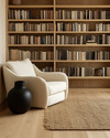
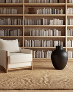
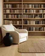
The core of a Japandi library’s color scheme lies in its sophisticated neutrals. Think soft, warm whites like Farrow & Ball's 'Wimborne White' or delicate greys such as 'Pavilion Gray' for walls and built-in shelving. These shades provide a breathable canvas, reflecting light and making the space feel expansive and airy. For larger furniture pieces like a substantial reading chair, consider upholstery in muted oat, charcoal, or a subtle linen beige to maintain this understated elegance.
Earthy Accents: Wood Tones and Natural Elements
Introduce depth and organic warmth through carefully chosen wood tones and natural materials. Light to medium woods, like blonde maple, white oak, or ash, are ideal for bookshelves, flooring, and accent tables. These woods carry a natural, subdued color that complements the neutral backdrop without overwhelming it. Consider:
- A low-profile white oak coffee table
- Maple shelving units with clean lines
- Woven jute rugs in undyed, natural tones
- Ceramic vessels in matte black or speckled cream
Subtle Color Infusions: Textiles and Decor
While the palette is largely neutral, judicious splashes of muted color can enhance the library's character. These should be subtle and drawn from nature. Think sage green in a throw blanket, a deep indigo cushion, or a terracotta-hued ceramic vase. The key is restraint; these colors should whisper rather than shout, providing a gentle counterpoint to the dominant neutrals and woods. Fabrics should be natural – linen, cotton, or wool – in solid colors or with very subtle, organic textures rather than busy patterns.
Frequently Asked Questions
What colors define a Japandi library's palette?
A Japandi library's palette focuses on warm whites, soft greys, and muted earthy tones from natural woods like white oak or maple, with very subtle accents of sage green or deep indigo.
How can I incorporate color without overwhelming the Japandi aesthetic?
Introduce color through natural textiles like linen throws or cotton cushions in muted, nature-inspired hues, or via small ceramic decorative items in matte finishes, ensuring they are used sparingly.
Which wood tones are best for a Japandi library's cohesive look?
Opt for light to medium wood tones such as blonde maple, white oak, or ash for bookshelves, flooring, and furniture, as these shades blend seamlessly with the neutral color scheme.
What wall colors work best to create a serene Japandi library?
Soft, warm whites like 'Wimborne White' or delicate, light greys such as 'Pavilion Gray' are ideal for walls, providing a calming and expansive backdrop.